Find the constraint. Build the system.
← Back to Results
Selected website work

Built around the next move.

The business problem. The design decision. The next step made easier. Explore how we connect websites, messaging and customer journeys—with desktop and mobile considered together.

The business behind the design

Start with the constraint.
Build toward the outcome.

Our e-commerce turnaround connects measurement, offers, website conversion and retention to one operating plan. It’s the business perspective we bring to the work below.

Explore the turnaround and its evidence →
Business-wide gross sales
+164%
Recorded orders
+119%

Full calendar Year 3 versus the reference year. Our founder’s prior consulting and in-house leadership work; business-wide outcomes shaped by a team and market conditions.

01 / Butcher shop & market · Proposed concepts

Hook N CleaverWin the lunch visit.
Earn the next butcher-shop customer.

Sandwiches and market items give people an immediate reason to stop in—and give owners Suzi and JT the opportunity to introduce their prime and aged beef, chicken and seafood.

The decision

Lead with what brings people in daily. Then make the wider selection easy to discover. Our proposed copy, conversion strategy and search-focused page structure connect a lunch decision to a longer relationship with the butcher shop.

  • Conversion strategy
  • Two website concepts
  • Desktop + mobile design
  • Copy + SEO foundations
THE KITCHEN DIRECTION

Appetite first.

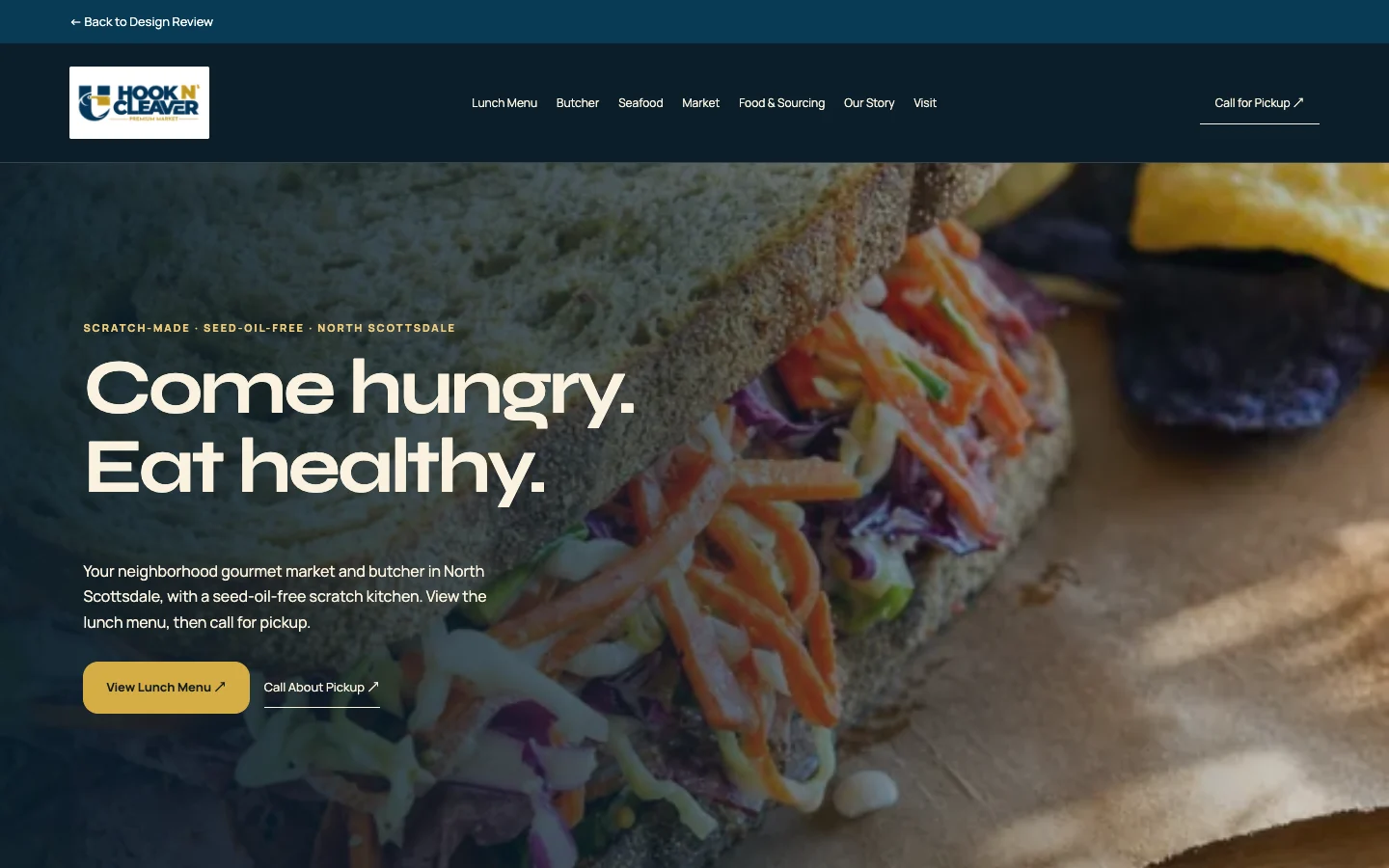
Desktop · explore the menu and market
Proposed Hook N Cleaver Kitchen desktop homepage
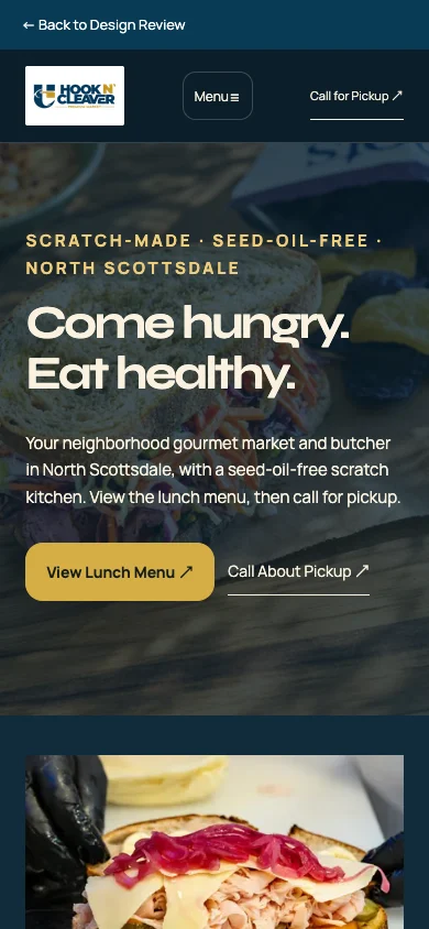
Mobile · decide where to eat, then act
Proposed Hook N Cleaver Kitchen mobile homepage

Immersive food photography brings the scratch kitchen forward. Lunch and pickup actions sit close to the message.

Follow the customer: Food photography earns attention. “View Lunch Menu” makes the next decision explicit; mobile visitors can call for pickup.

THE SOURCE DIRECTION

Ingredients take the stage.

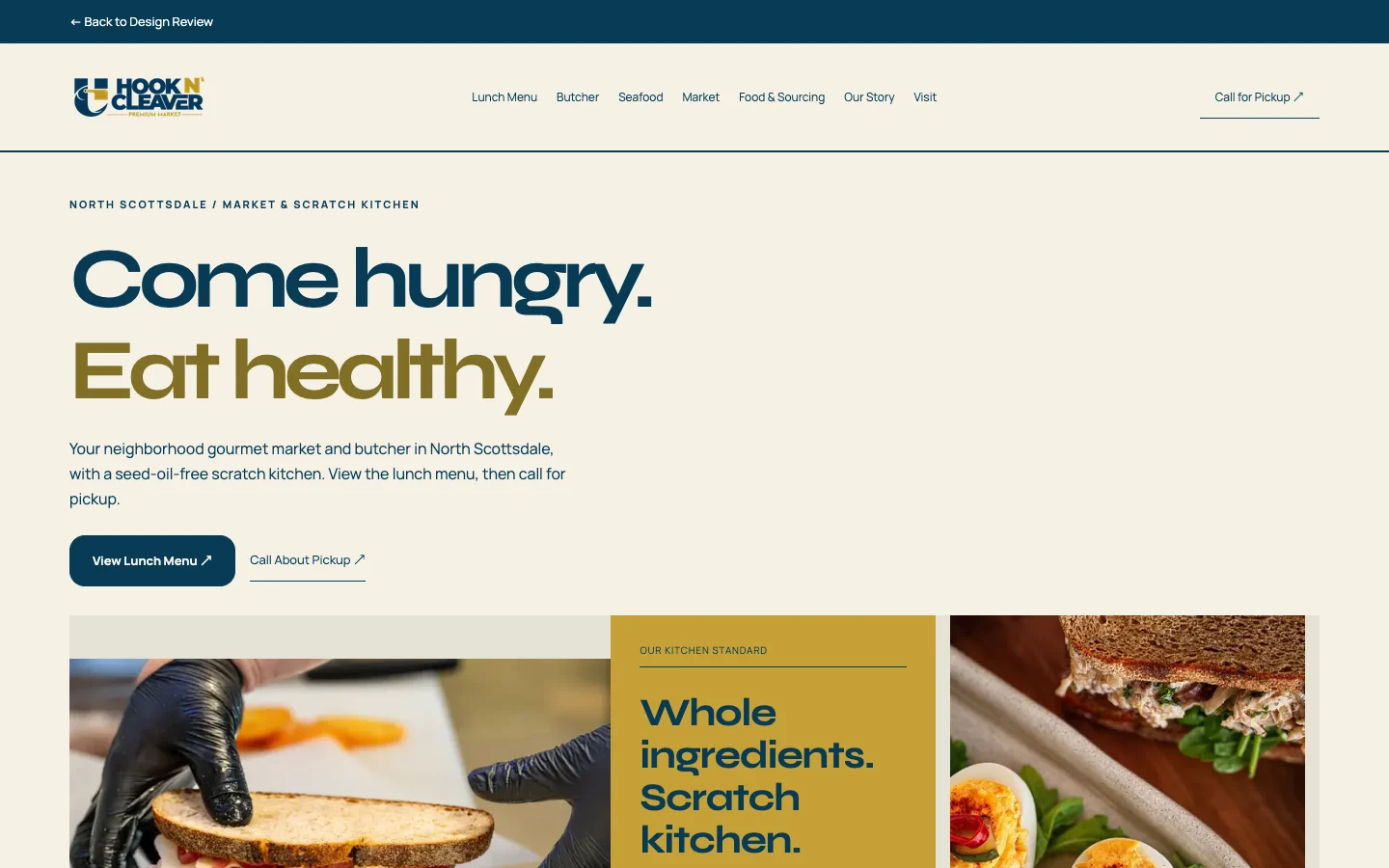
Desktop · explore the menu and market
Proposed Hook N Cleaver Source desktop homepage
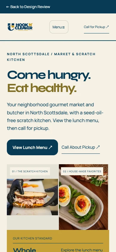
Mobile · decide where to eat, then act
Proposed Hook N Cleaver Source mobile homepage

A brighter editorial layout connects preparation, sourcing and the food customers can take home.

Follow the customer: Lunch leads the story, while market and sourcing routes introduce what is behind the meal. Mobile keeps the menu and pickup route close.
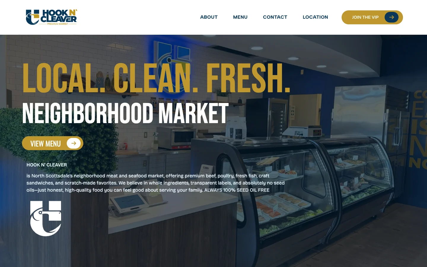
Current Hook N Cleaver client homepage, reference capture
The starting point

A market with more to discover.

The current client website provides context. Our proposals bring lunch forward, separate the founder story from food sourcing, and carry the same strategy through eight pages in each direction.

Kitchen and Source are owner-review concepts, not a launched client redesign.

  1. A reason to visit todaySandwiches and everyday market needs.
  2. A chance to discover moreMeet Suzi and JT and explore the butcher selection.
  3. A relationship worth growingEarn return visits and develop the butcher business sustainably.

What this sets upA conversion strategy built around daily demand and gradual discovery. The concepts demonstrate the intended journey; they do not yet establish traffic or sales results.

↑ Back to projects
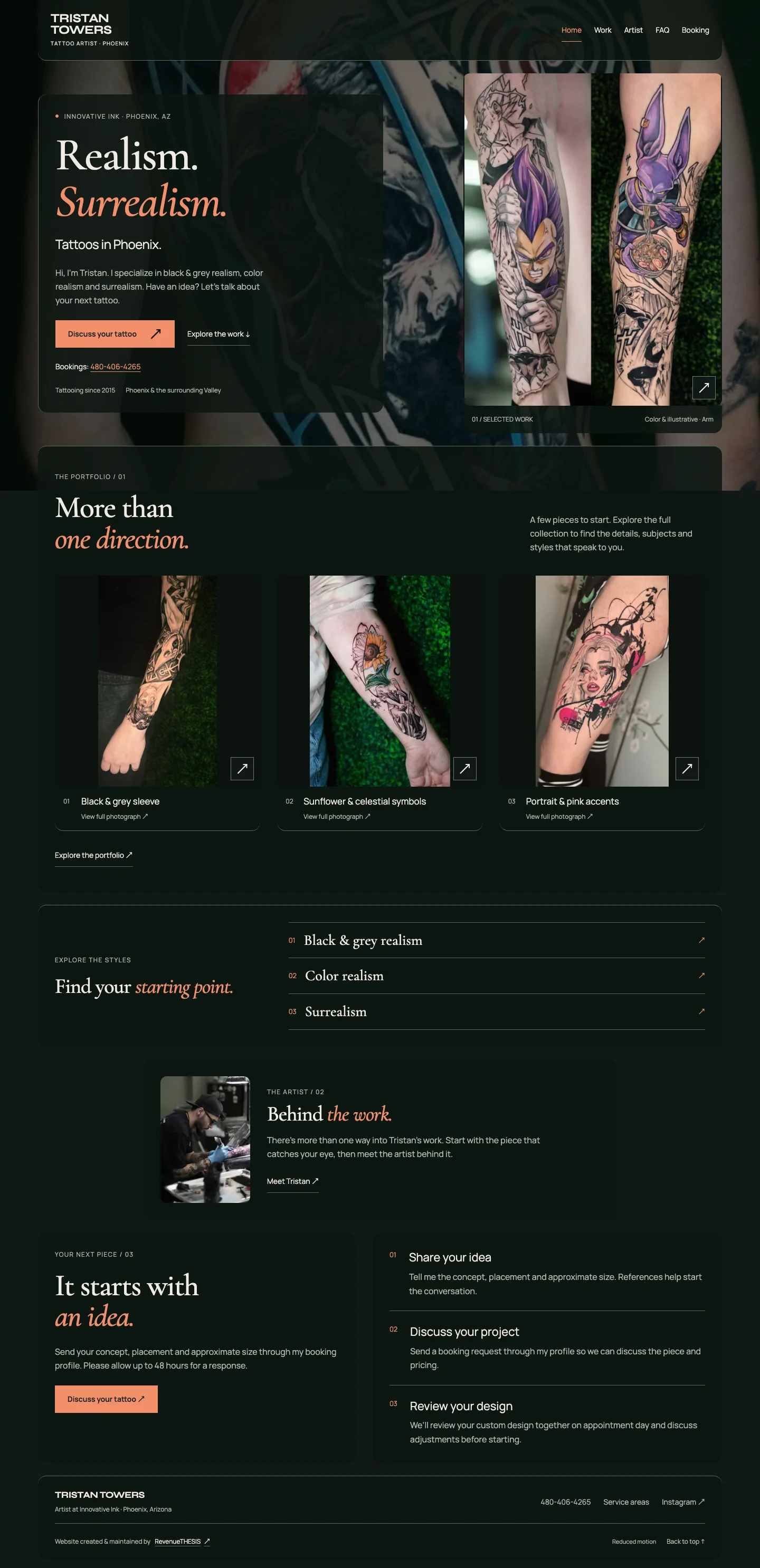

02 / Tattoo Artist · Website delivered

Tristan Towers InkA home for the artwork.
A clear path to booking.

Tristan needed a website to show his work and one central place to accept booking inquiries for his tattoo business. We built that foundation, then refined how visitors explore the artwork and find their next step.

  • Website design + development
  • Tattoo portfolio
  • Centralized booking inquiries
  • Mobile performance
Desktop · discover the artist and explore the work
Tristan Towers Ink desktop homepage with artwork and booking direction
Mobile · the same artist, a direct next step
Tristan Towers Ink mobile homepage with artist identity and booking action
From an artwork to a booking conversation

Explore the actual mobile sequence: browse the gallery, inspect a full-size piece, then open booking guidance. The final action connects to Tristan’s booking request form.

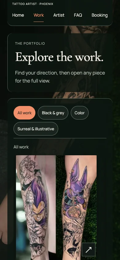
Explore the gallery · actual mobile interaction
Tristan Towers Ink mobile journey: Explore the gallery
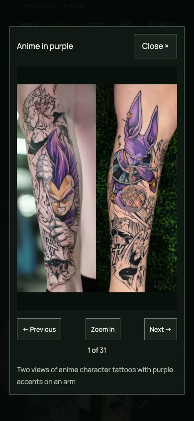
Inspect the artwork · actual mobile interaction
Tristan Towers Ink mobile journey: Inspect the artwork
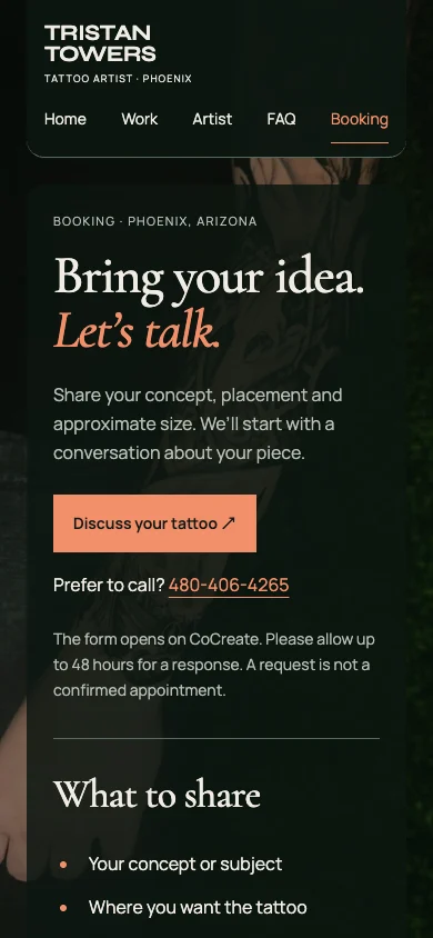
Reach booking guidance · actual mobile interaction
Tristan Towers Ink mobile journey: Reach booking guidance

A captured interaction sequence, not a simulated booking or a submitted appointment request.

One detail that changed the experience

We replaced the long image stack with a browsable gallery, keeping style choices and the next step within reach. Desktop and mobile share the same journey, with room for the artwork on each screen.

Matched 390px Work-page captures, replayed from two retained releases. Detail windows show the gallery area of each capture. These are iterations of our delivered site.

The technical difference

Lighter delivery.
A stronger mobile lab result.

Lighthouse mobile score
59 → 90
Largest Contentful Paint
6.3s → 1.8s
Requested fonts
808 → 93KiB

Matched live-URL Lighthouse mobile simulation. Font payloads are approximate. Lab results, not field performance or booking growth.

Building nextWe’re helping Tristan establish his first Google Business Profile and prepare paid advertising to expand visibility. As reviews come in, they can add social proof to the website. The next stage is building out his sales and marketing funnels.

↑ Back to projects
03 / Hair Stylist & Colorist

LivforCOLORThe right clients.
A clearer way to find her.

LivforCOLOR needed a website and stronger visibility where prospective clients search. We built a service-focused website, supported her Google presence and connected discovery to a clear consultation path.

Five-star Google reviews
5
In her first month
Leads during her new Google campaign
More than 15
During the first 20 days
  • Website design + development
  • Service messaging
  • Local-search visibility
  • Targeted Google advertising
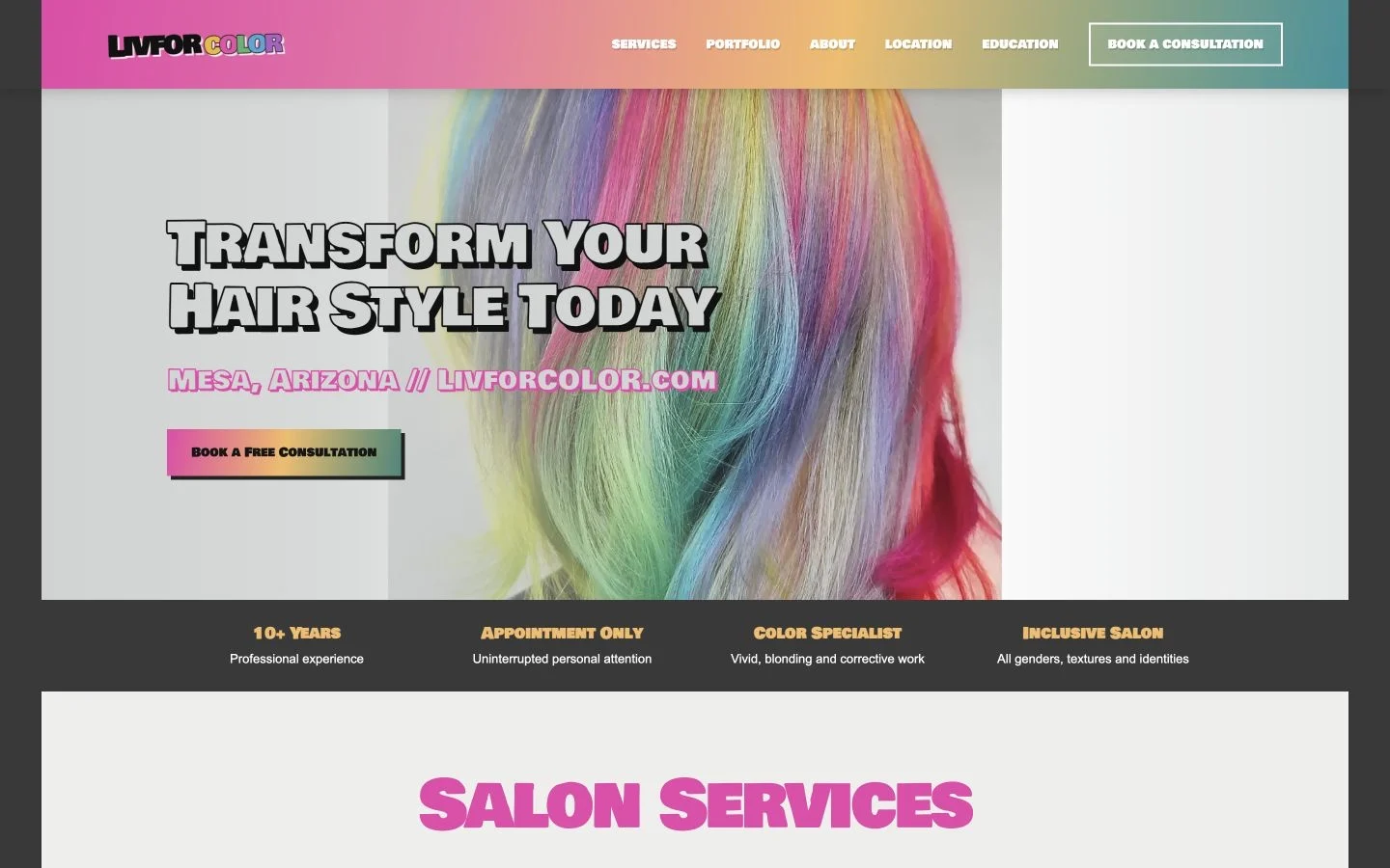
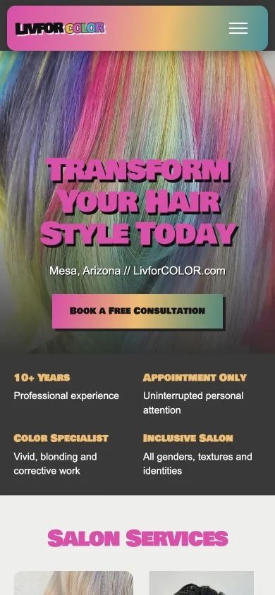
Desktop · see the work and choose a starting point
LivforCOLOR desktop website with real hair photography and consultation route
Mobile · discover, understand, reach out
LivforCOLOR mobile homepage with hair photography and consultation action
From discovery to consultation
  1. Show the work that fits the client.Real hair photography and clear specialties help visitors recognize the right service.
  2. Answer before asking.Service explanations give prospective clients context before they begin a consultation.
  3. Bring the right people to the experience.A highly targeted, low-budget Google campaign supports local discovery.
Explore LivforCOLOR ↗
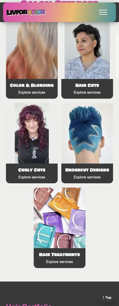
A closer look · mobile service discovery
LivforCOLOR mobile service grid makes color, cut and treatment choices easier to explore

Early results reported by RevenueTHESIS’s founder. Leads describe inquiries, not confirmed bookings or revenue.

Building on the momentumKeep learning from the inquiries, strengthen the path from interest to consultation and support her business as it grows.

↑ Back to projects
More ways the strategy takes shape

Different businesses.
The same attention to the next step.

04 / Studio & media · Full site build + SEO

Hit WarehouseA studio with
a story to tell.

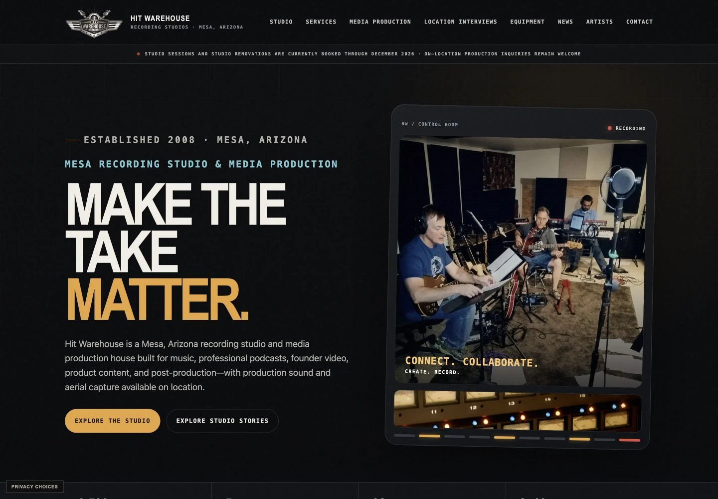
RevenueTHESIS built the full website and SEO foundations for this founder-owned venture. The visual system connects studio positioning, photography and music culture with an editorial experience worth exploring.

  • Full website build
  • Editorial presentation
  • SEO foundations
  • Responsive optimization
Desktop · establish the studio’s identity
Hit Warehouse desktop homepage with studio positioning and service routes
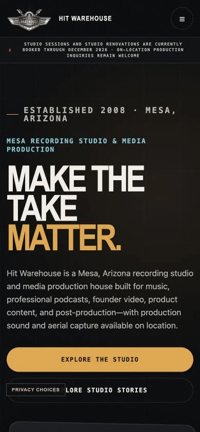
Mobile · keep discovery and navigation close
Hit Warehouse mobile homepage with studio identity and responsive navigation

Beyond the homepage: Artist stories and photo-led editorial layouts build context around the studio. Clear service routes connect that interest to the business; image and font optimization support the reading experience.

See the mobile editorial detail ↗

Full website build and SEO by RevenueTHESIS. The studio’s current availability notices remain visible in the captures.

Explore Hit Warehouse ↗ ↑ Back to projects
05 / Product website · Delivered public experience

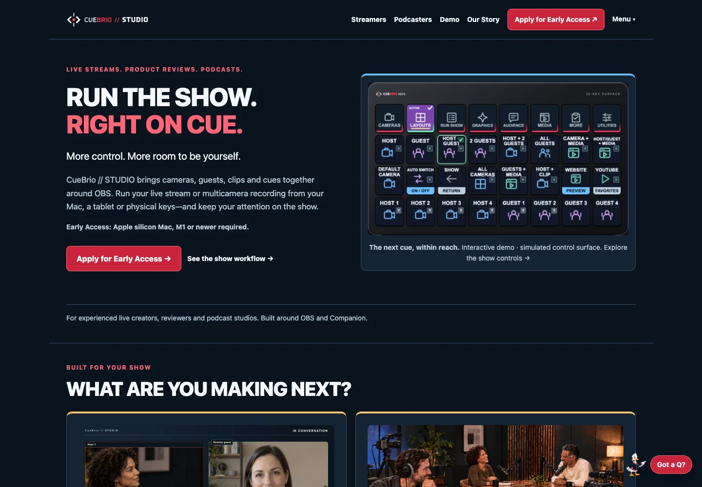
CueBrioFrom “what is it?”
to “I’m ready.”

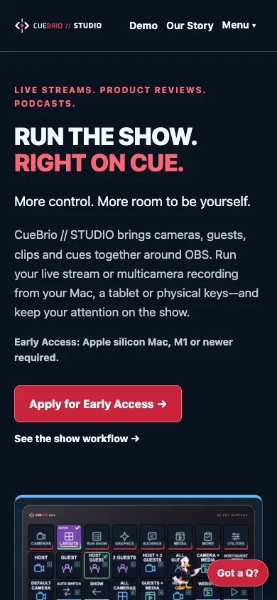
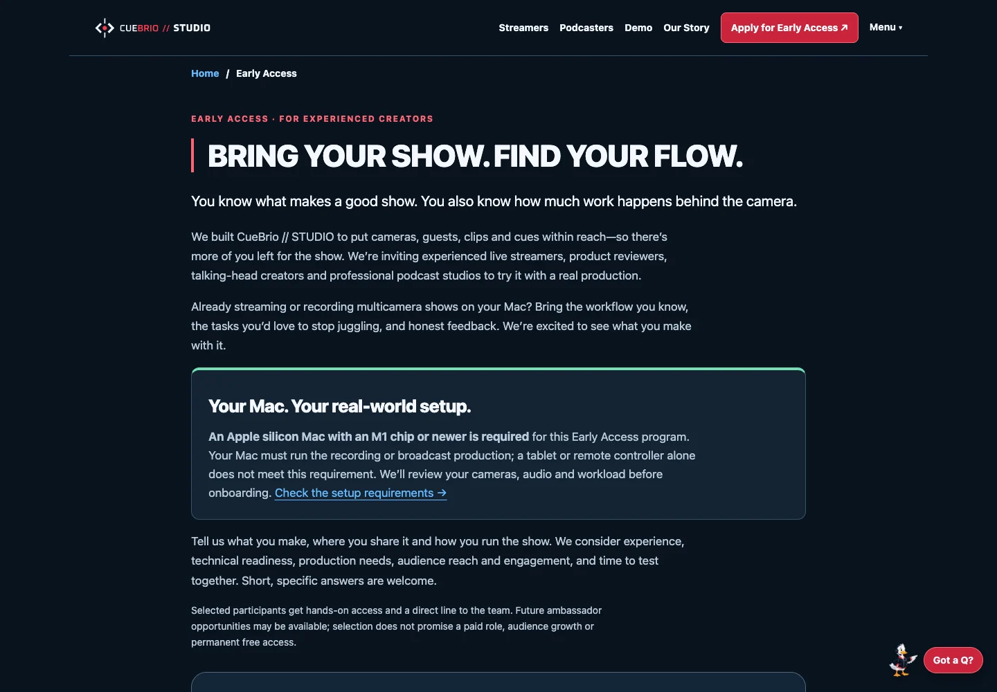
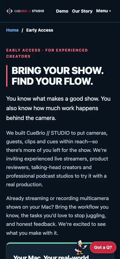
A product story connected to the next step. Creator-focused messaging, visible setup requirements and an invitation journey carry a consistent identity from discovery into onboarding.

  • Creator-focused copy
  • Desktop + mobile design
  • SEO metadata
  • Early-access + invitation journey

Select a stage to explore

Explore CueBrio ↗
Desktop · Understand the product
CueBrio desktop website: Understand the product
Mobile · Understand the product
CueBrio mobile website: Understand the product
Desktop · Find the right fit
CueBrio desktop website: Find the right fit
Mobile · Find the right fit
CueBrio mobile website: Find the right fit
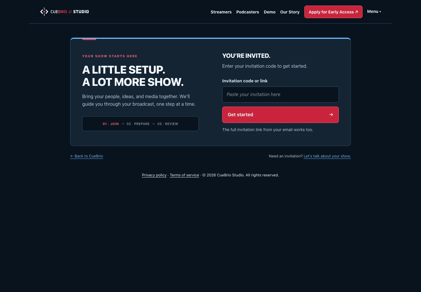
Desktop · Enter by invitation
CueBrio desktop website: Enter by invitation
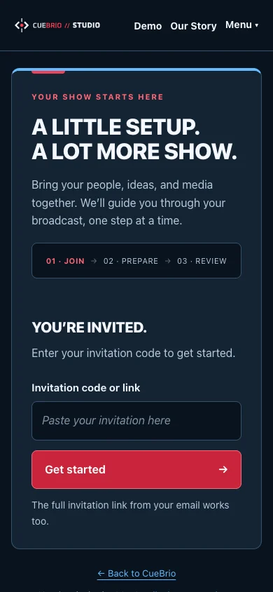
Mobile · Enter by invitation
CueBrio mobile website: Enter by invitation

The homepage control-surface demo is illustrative. This exhibit shows product messaging and the public entry experience.

↑ Back to projects
Your next chapter

What should your next customer
be able to do more easily?

Talk about your project →Explore measured e-commerce results ↗